In early 2022, we launched the rebranding of the Superlógica brand.
Context: Superlógica is the largest technological and financial platform for the condominium and real estate market in Brazil, operating in the segment for over 20 years. Evolving visual communication was the challenge.
The rebranding project was carried out by the Superlógica Design Team, in which I was part and was responsible together with my dear friend Bells Domingos and under the leadership of the illustrious Daniel Campos, during 2021. We collaborated with the Brand team at the time in the construction of the entire platform of brand: purpose, values, positioning, brand persona and tone of voice, culminating in a complete redesign of the identity and visual system of the brand.
The logo
Challenge: aim for the company’s future without giving up the legacy.
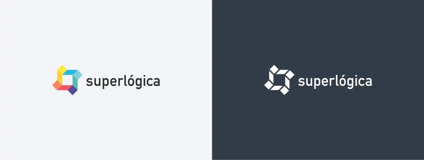
Icon: some of the applicability problems of the old brand were the number of colors in the icon that caused contrast problems depending on the colors used as background, restricting the application of the fullcolor logo in most projects.
The application of the logo on any background other than white needed to be monocolored and as a result the icon underwent a very large change, generating another version to try to represent the main version resulting in two different icons, generating twice as many files. Its counter-form also presented problems in reduced applications.
The 8-color icon also made it difficult for us to identify a Superlogic color, since almost no color could perform as well, as there would be 8 other colors to “fight” with the brand’s power-color. This meant that the Superlógica logo could not use a predominant color as a powerful identification asset, strategically used in companies such as Coca-Cola, iFood, Nubank, Will Bank, Nintendo, Playstation, Apple and etc. Due to the fact that the Superlógica brand lives in a predominantly digital universe, it was necessary to simplify the colors of the logo, paving the way for the choice of an identification color.
Consequently, the secondary logo (monocolor) was used most of the time, as its application was “easier” on any type of background, and in product/advertising communication, there was no situation where the logo with 8 colors could be well applied.
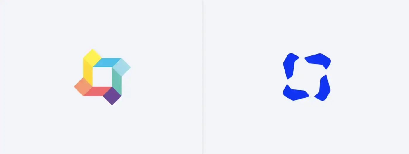
I started by reinterpreting the symbol, maintaining the visual equity and respecting the brand’s history, rethinking its design. The solution found was the simplicity of using the old icon as a counter-form to the new icon.
The decision to use the previous icon as a negative, in addition to not completely breaking with the visual legacy of the brand, maintaining an identification link, allowed me to work on an icon with a single shape. By taking this path, several possibilities opened up for the use of the Superlógica brand, even allowing the solution, when necessary, to use a monochromatic version without the need for different logos.
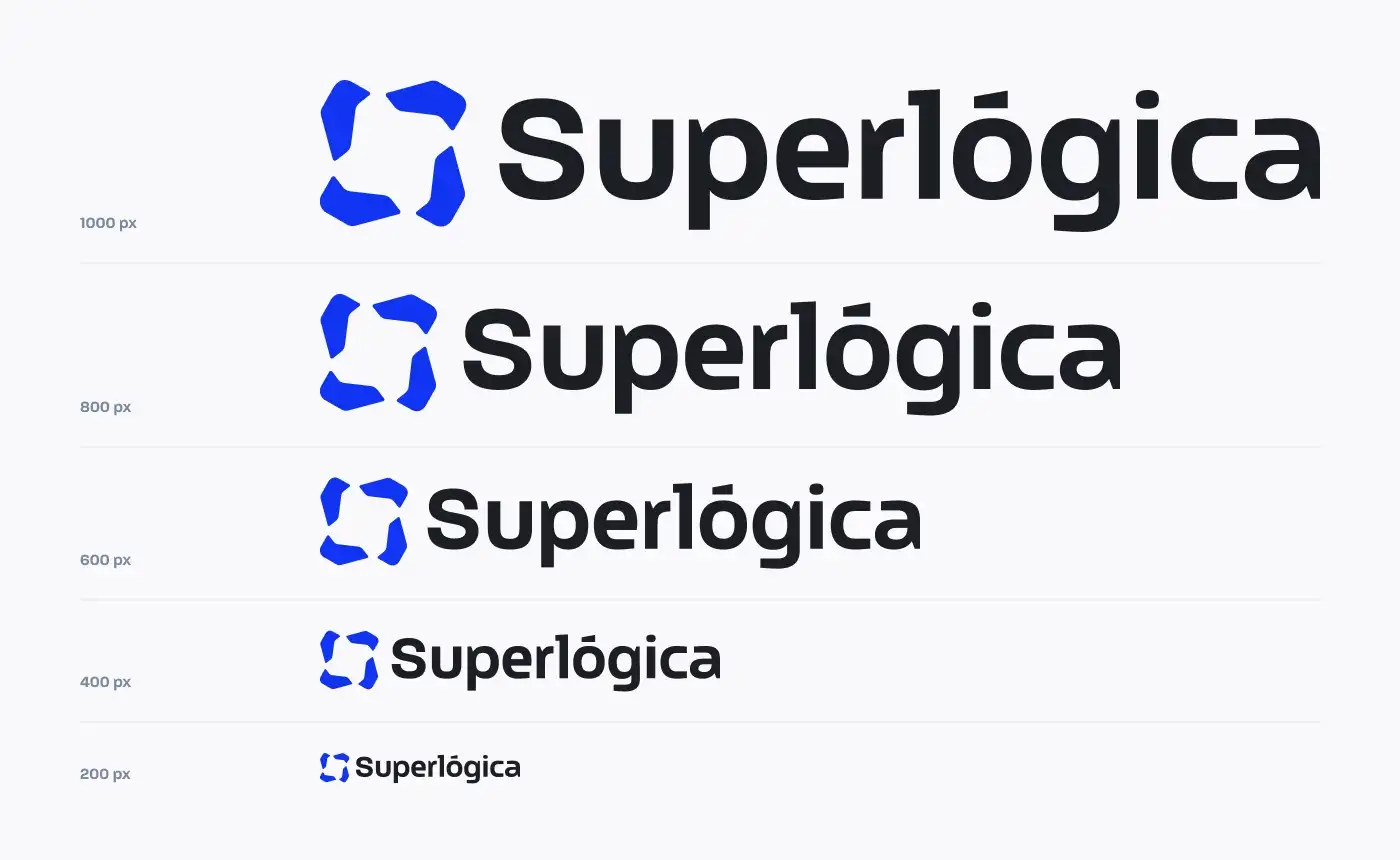
Now we have a harmonious visual solution that, in addition to respecting its history, values consistency by solving technical problems such as reduction, applicability in different backgrounds with a single brand.
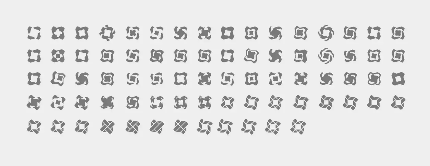
Icon’s backstage: the stage of studies, doodles and tests guide and establish prerequisites of what I believe should not be done, even though we are often clear that such a test will not work, I think it is important to perform it for comparative terms and substantiate the solution found between visual harmony, technical solution and symbology. With a quick visualization in the image below, one of the imminent dangers was the possibility of interpreting some of the symbols like a soccer ball, car hubcap and even a swastika.
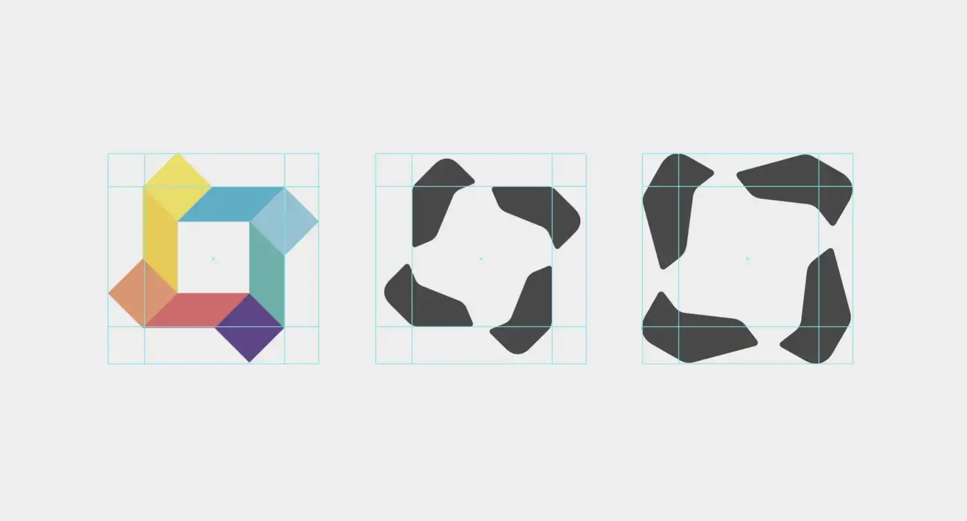
Simple and effective detail: the old icon’s vertices had a “confusing role” in its safety margin, when taken into account it caused excess white space, and when disregarded it resulted in an optical strangeness of lack of breathing. The simple solution of rotating the icon, aligning the external vertices with the internal ones, in addition to giving the sensation of movement, better use was made of the same space used by the old icon, consequently better harmony in the counter-shape between icon and lettering, and clarity in the margin of security.

Lettering: there was a need for lettering to accompany the change in the company, purpose, values, positioning, brand persona and tone of voice. I needed something more robust, technological, personalized.
After typographic research, benchmarking and deciding on the official typography to be used in the communication, I started working on its manipulation with the aim of achieving its own personality and managing to apply the smallest possible logo without compromising legibility.
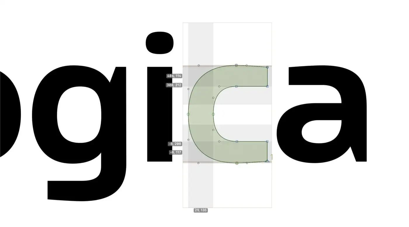
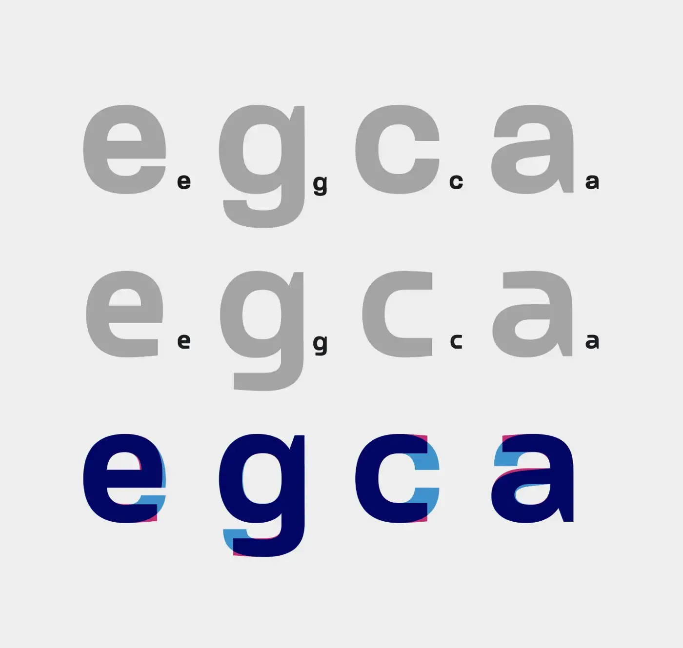
One of the processes I used to test and choose the thickness of both the icon and the lettering was to work with the Glyphs masters and create a variable font for both the typography and the icon to more accurately find the best balance between maximum reduction, lettering weight and relation to the icon.
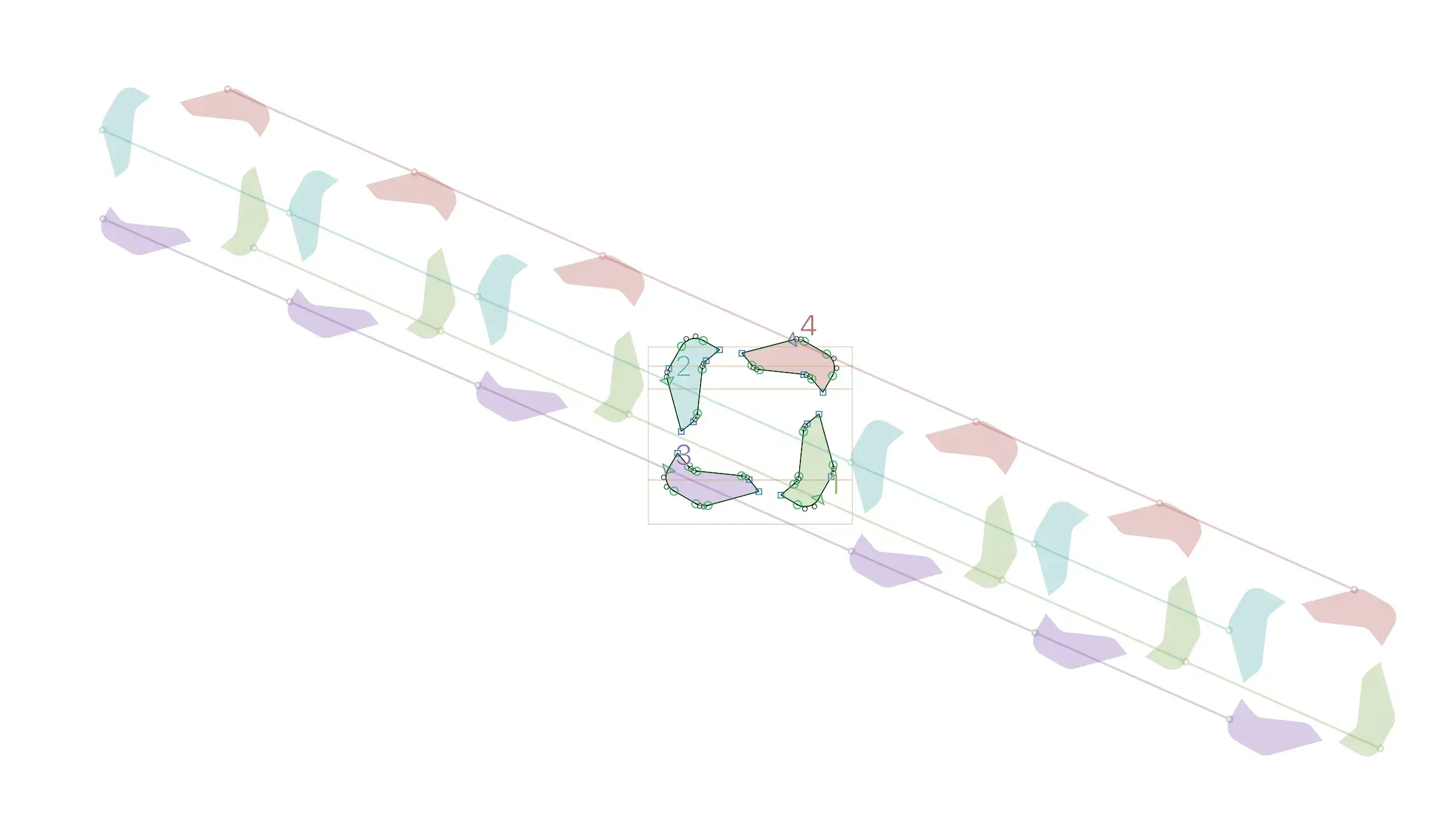
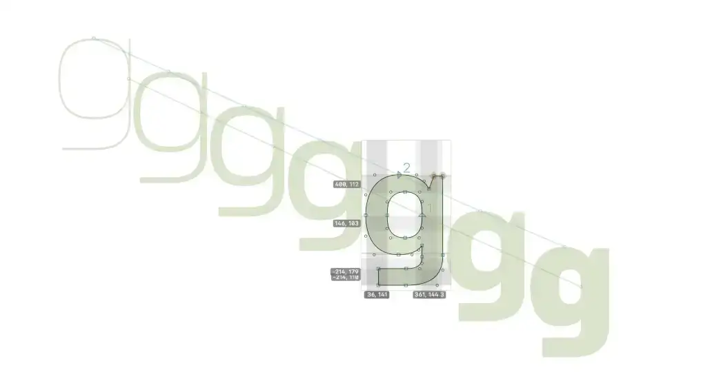
Below is one of the processes mentioned above: extreme tests to obtain the desired thickness for after refining the final logo.
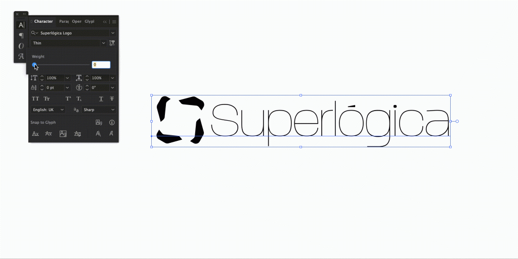
Now we have a distinctive and useful logo everywhere Superlógica can be, respecting all the legacy built over the years.
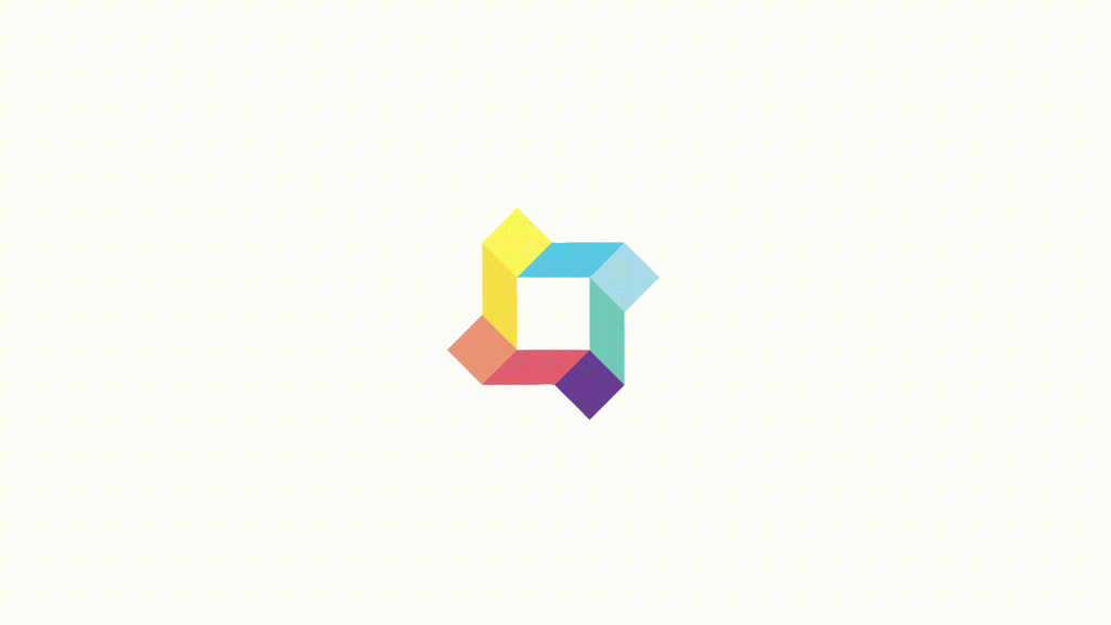

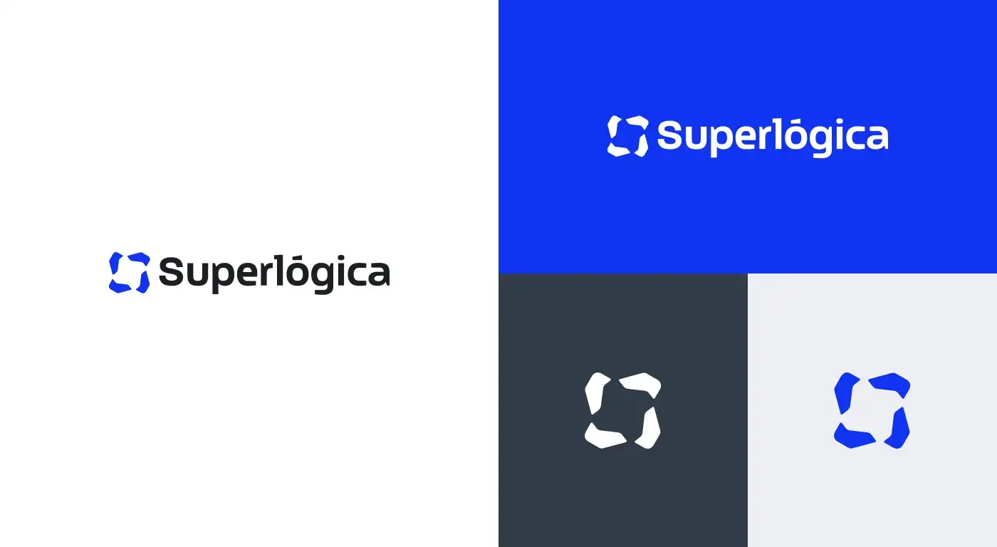
What I show here is just the process of designing the lettering and redesigning the icon, however the project is bigger and more complex than that. If you’re interested in learning more about what the Superlógica team did, you can find the complete rebranding case on Behance, where we tell and show you a little more, from a strategy and problem-solving perspective.
Design Language
Also, in an effort by the Design Team Superlógica under the direction of Daniel Campos, and leadership of my great friends Emerson Lemos and Hugo Fabrício, we created the Superlógica Design Language website, a work tool in constant evolution, which registers and regulates the creative use of our brands and assets, for communication or product. It offers files, good practices and guidelines for using the brand and its products, as well as other brands of the Group.

