Nahor Slab
PT
Porque não?
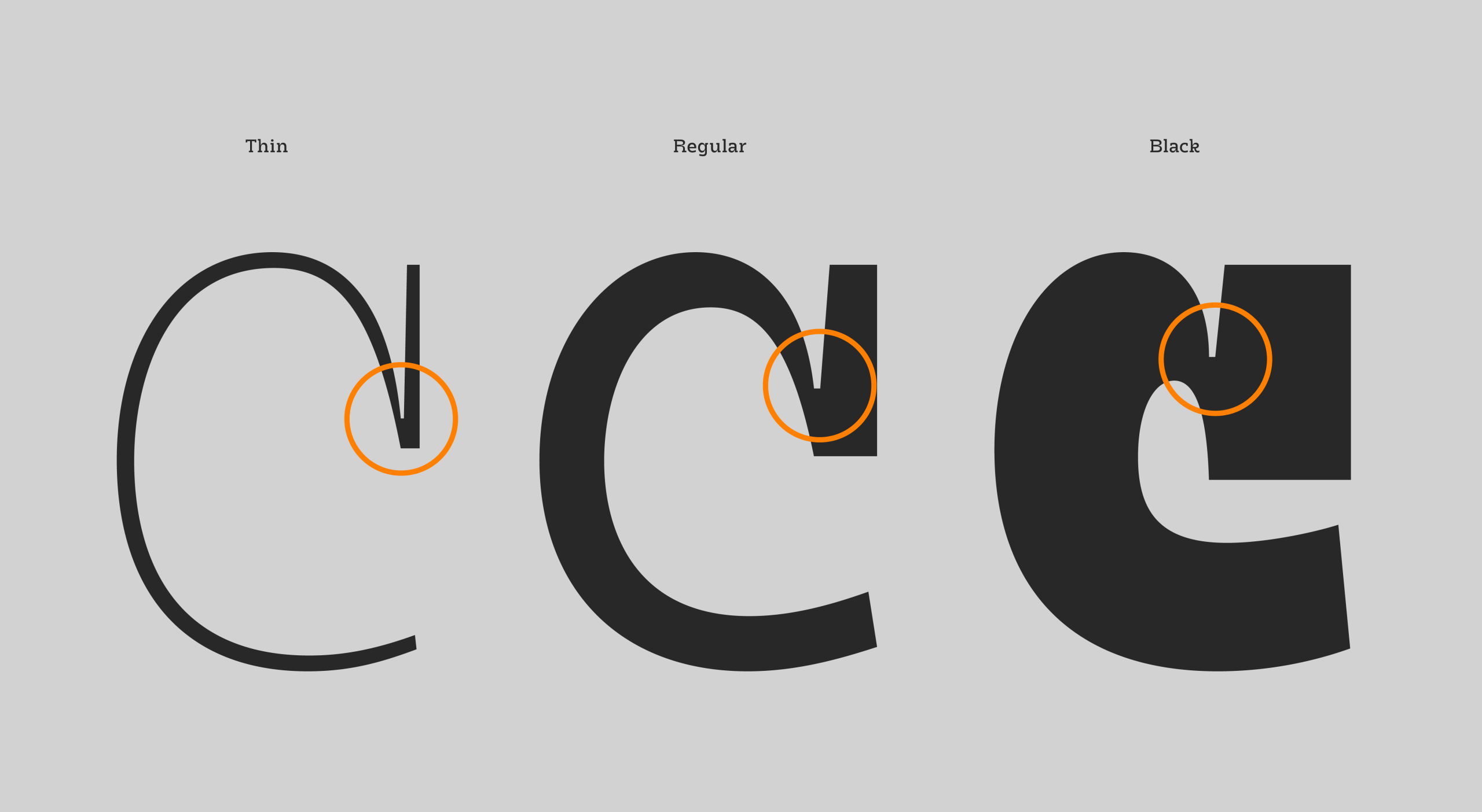
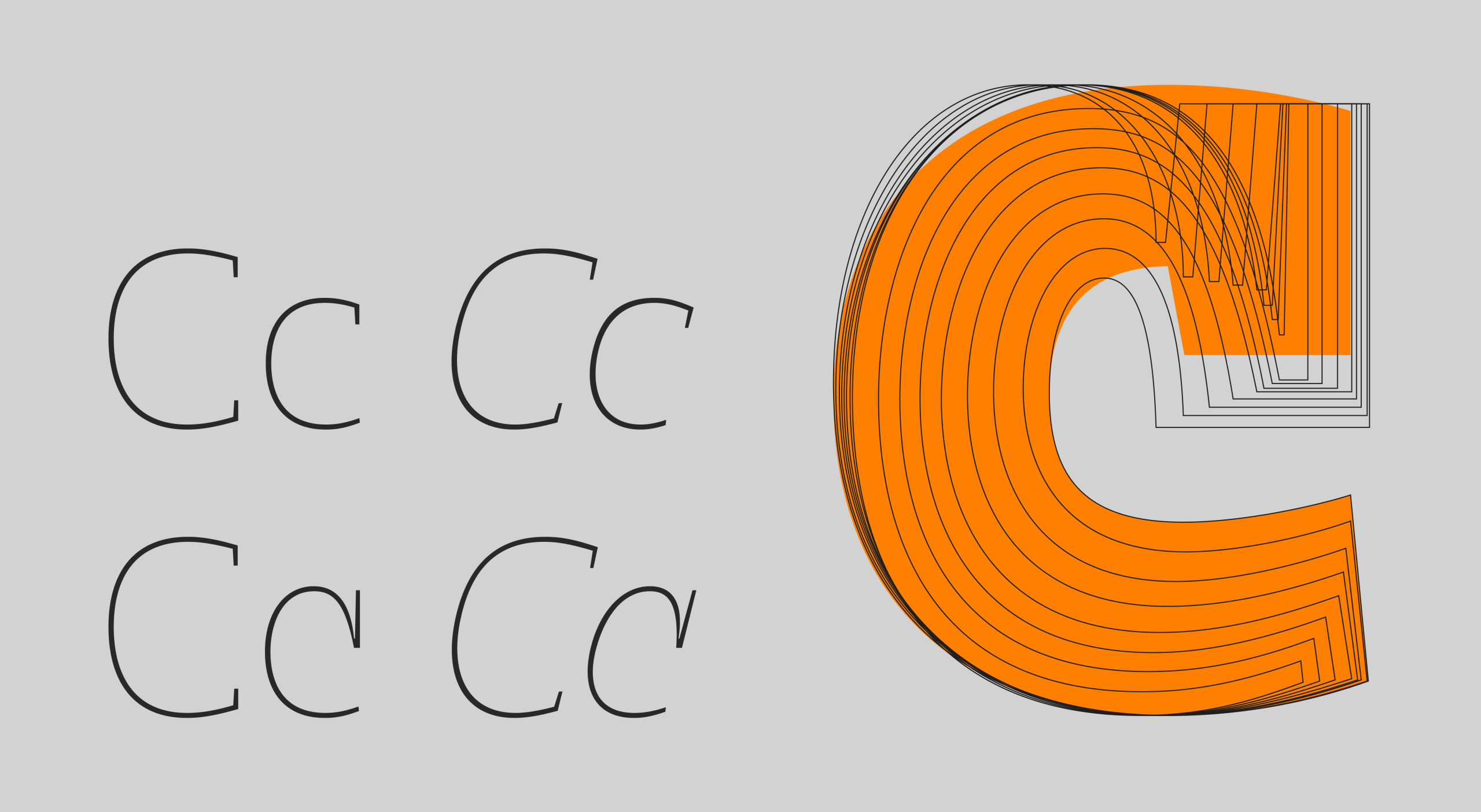
Fazer a Nahor Slab foi mais desafiador do que me pareceu, e apaixonante. Mesmo possuindo toda a estrutura da Nahor Sans, conforme fui trabalhando na slab, fui descobrindo atributos e armadilhas que precisei me aprofundar.
Mas aqui quero compartilhar outra visão além da parte técnica da fonte, um backstage: enquanto trabalho na fonte, já vou pensando em suas possibilidades de aplicações. É uma slab, ela tem seu lugar conquistado no consciente humano: "robustas", "estáticas", "tradicionais", normal.
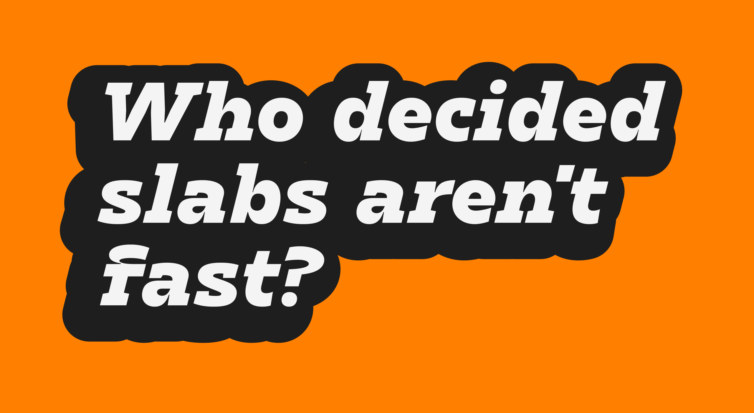
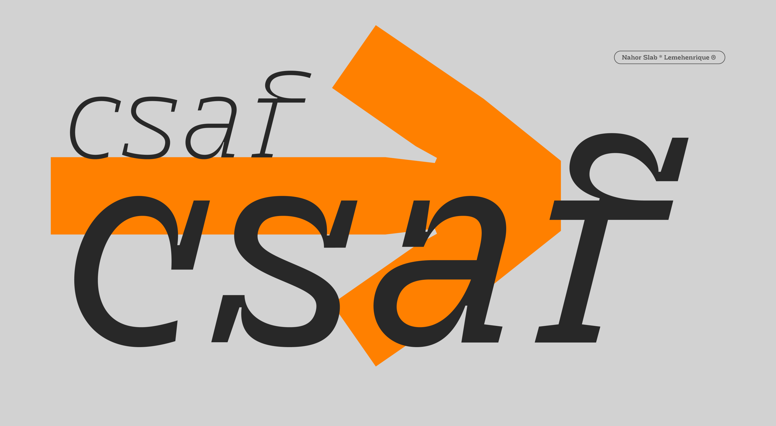
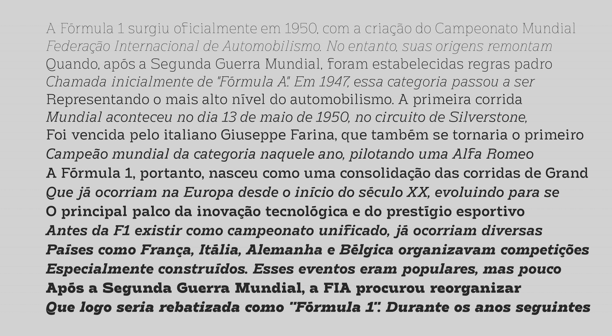
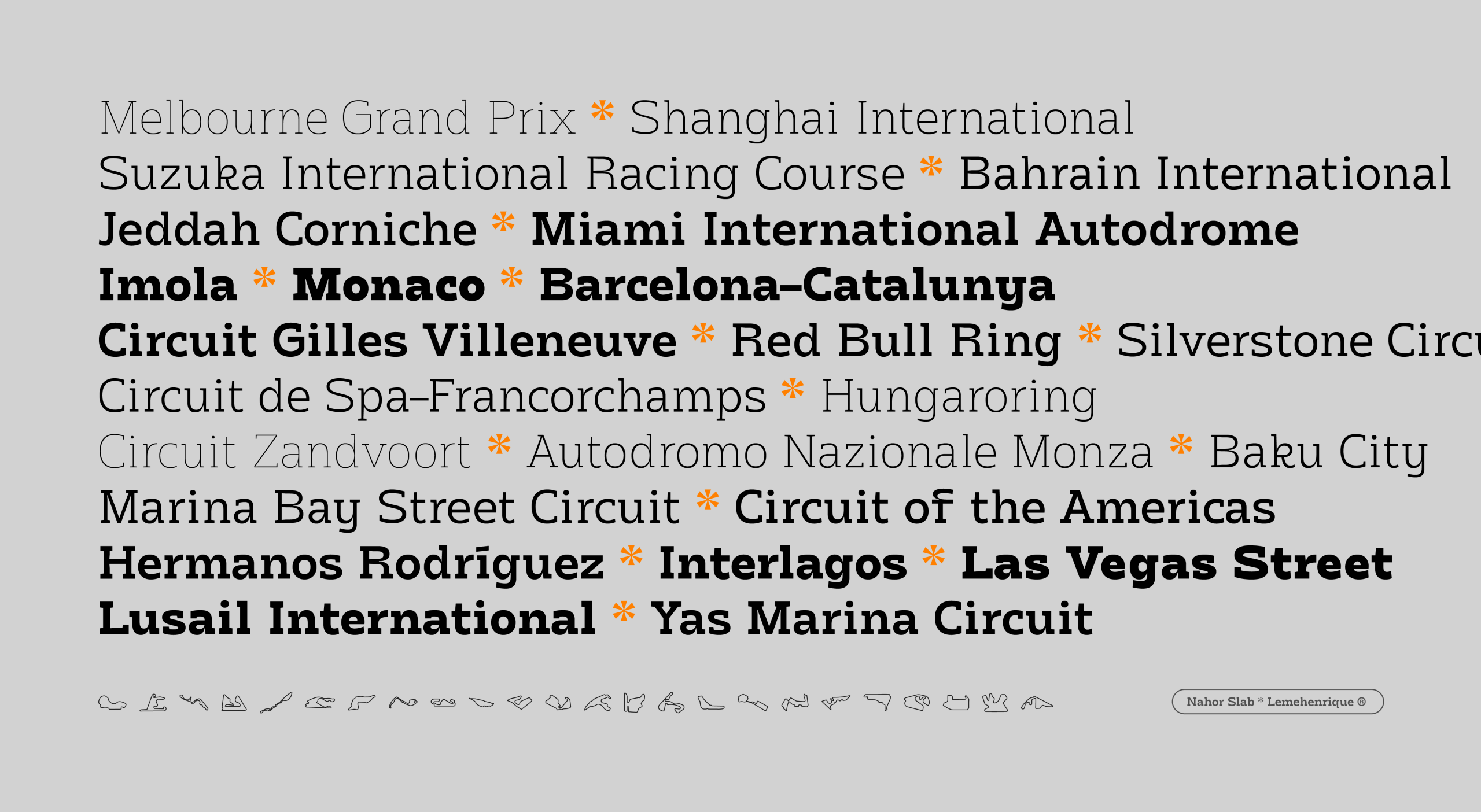
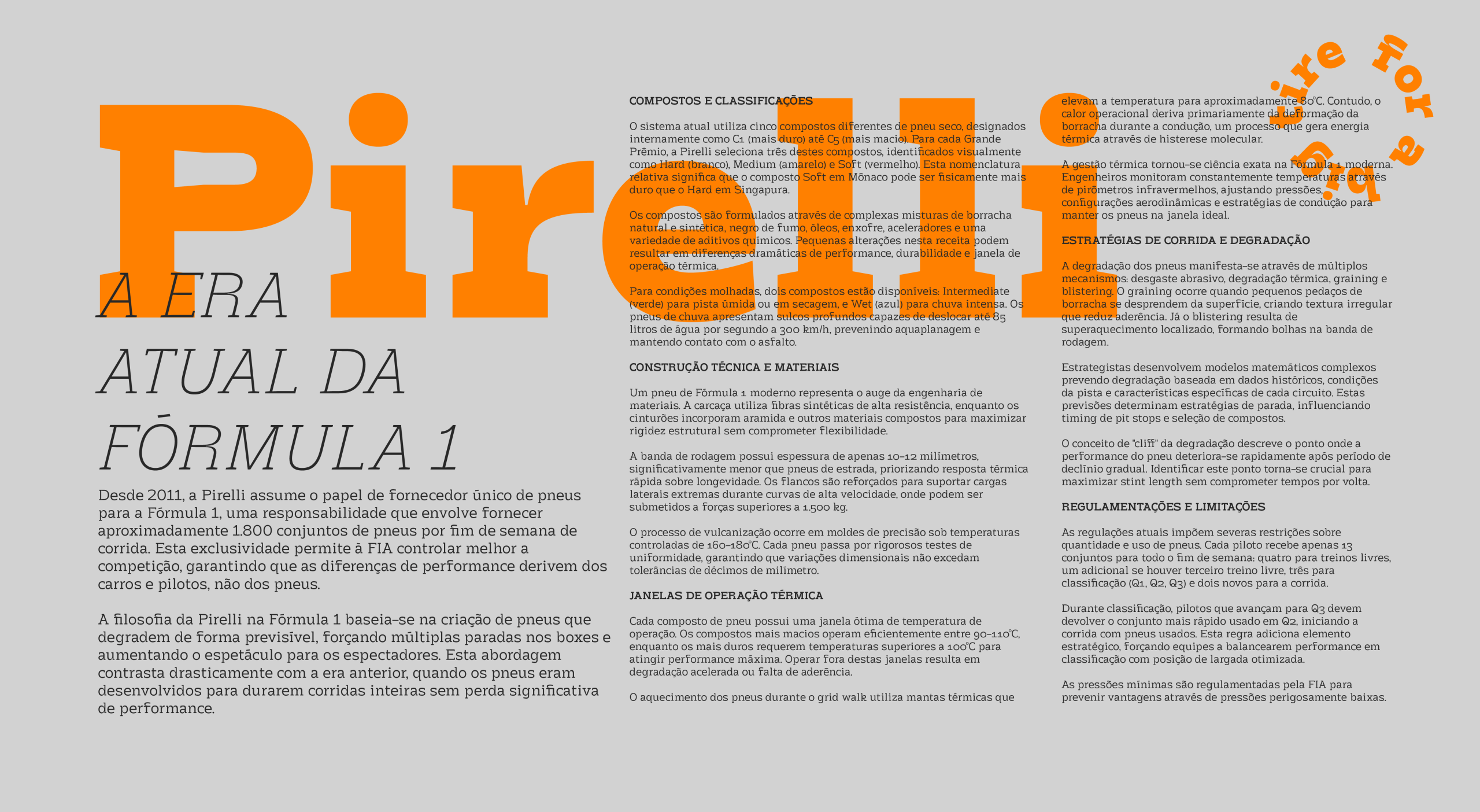
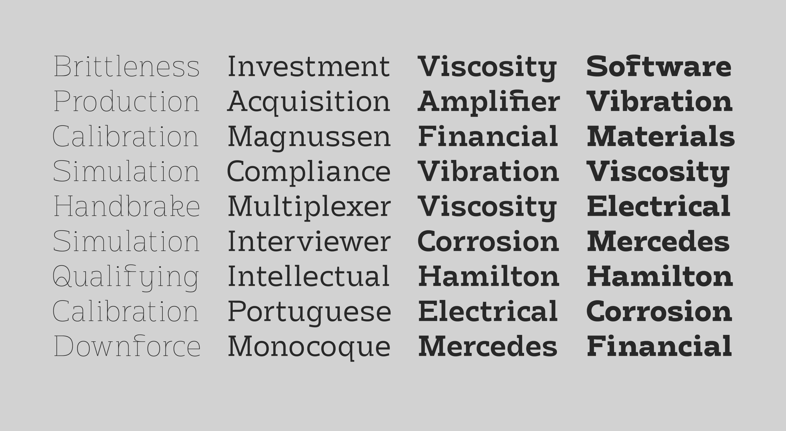
E como o specimen da Nahor Sans foi aplicado em ilustrações da F1, porque não fazer o mesmo com a slab? Então, além do prazer em desenvolver mais uma família tipográfica, tive o prazer de quebrar expectativas na sua campanha de lançamento - aplicando uma slab serif onde teoricamente ela "não deveria" estar. Por que não slabs na Fórmula 1? O esporte com mais patrocinadores e textos aparentes em um final de semana?
This shouldn't work, but it does.
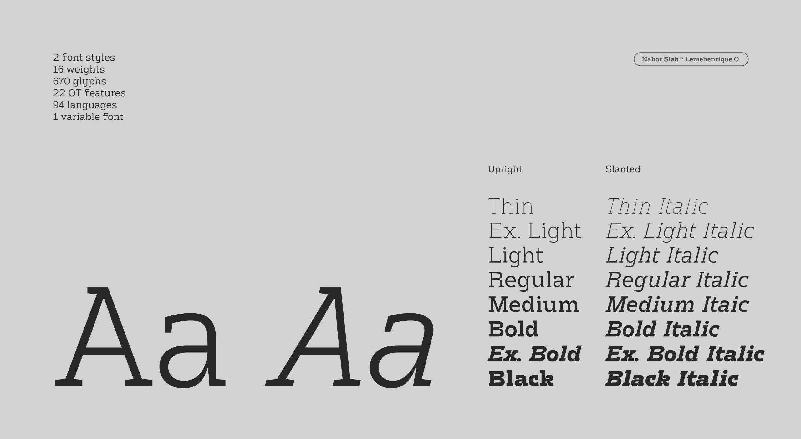
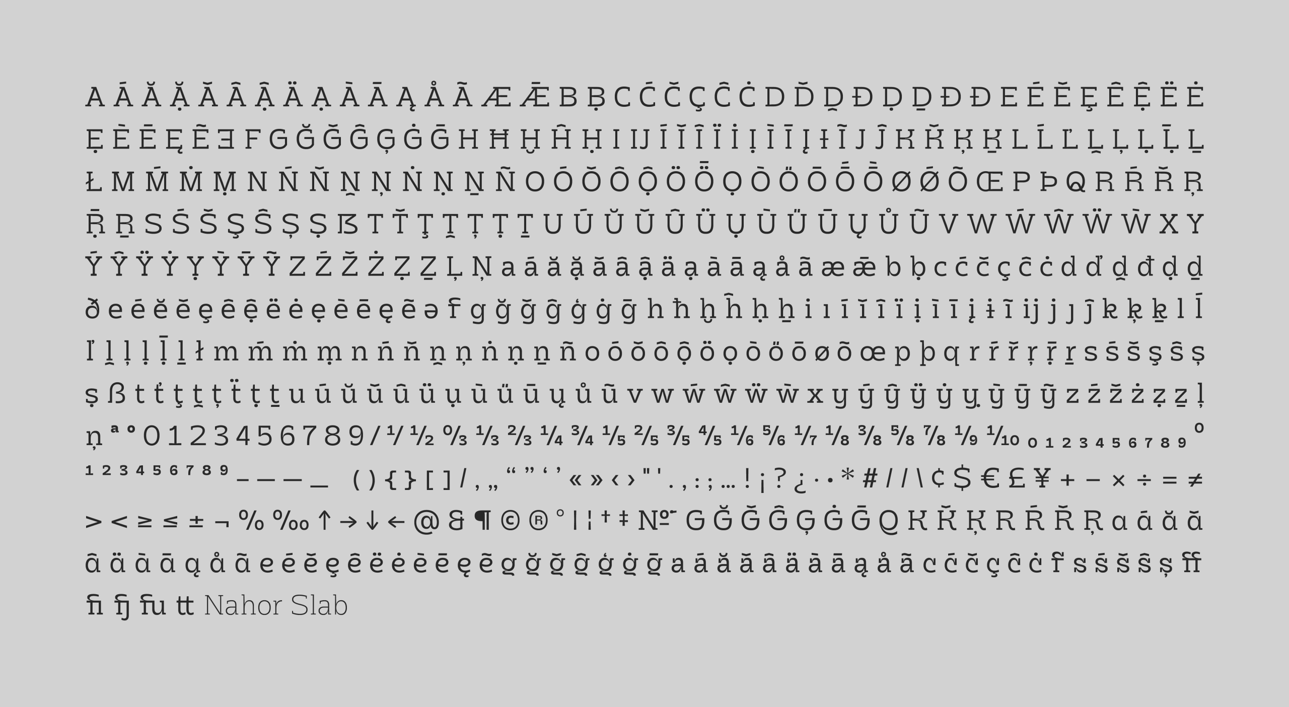
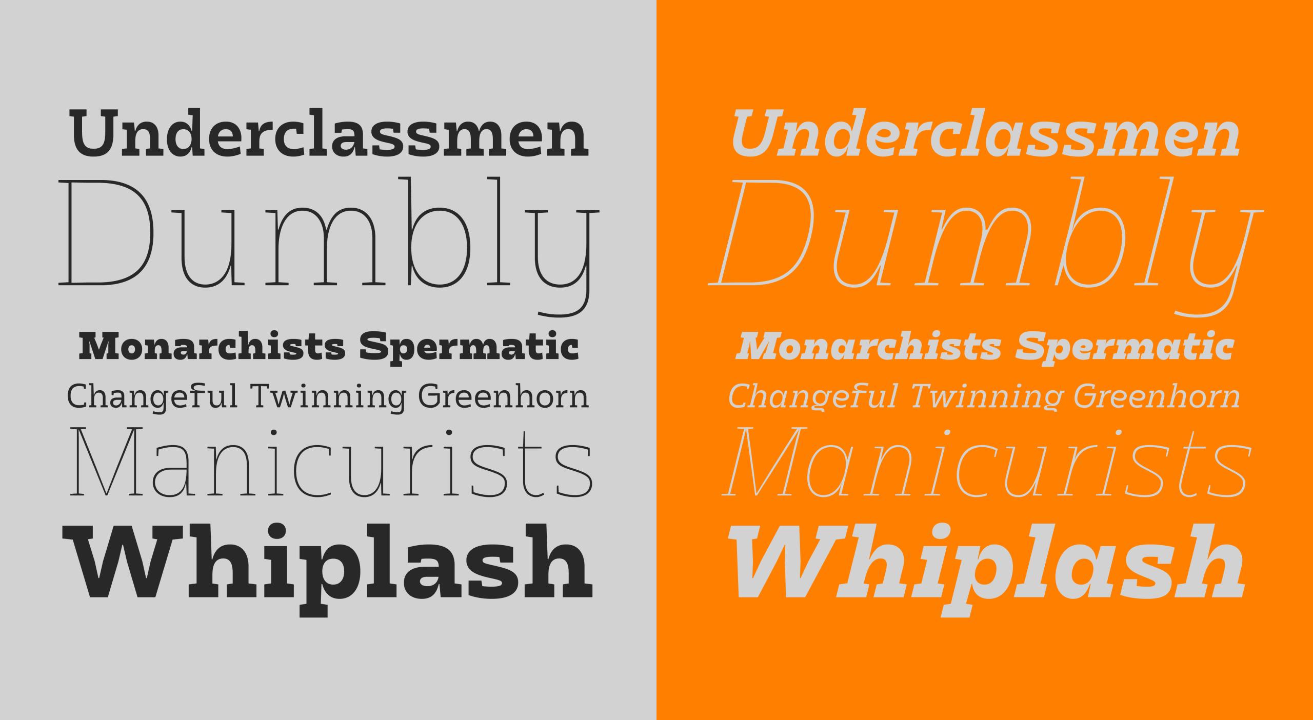
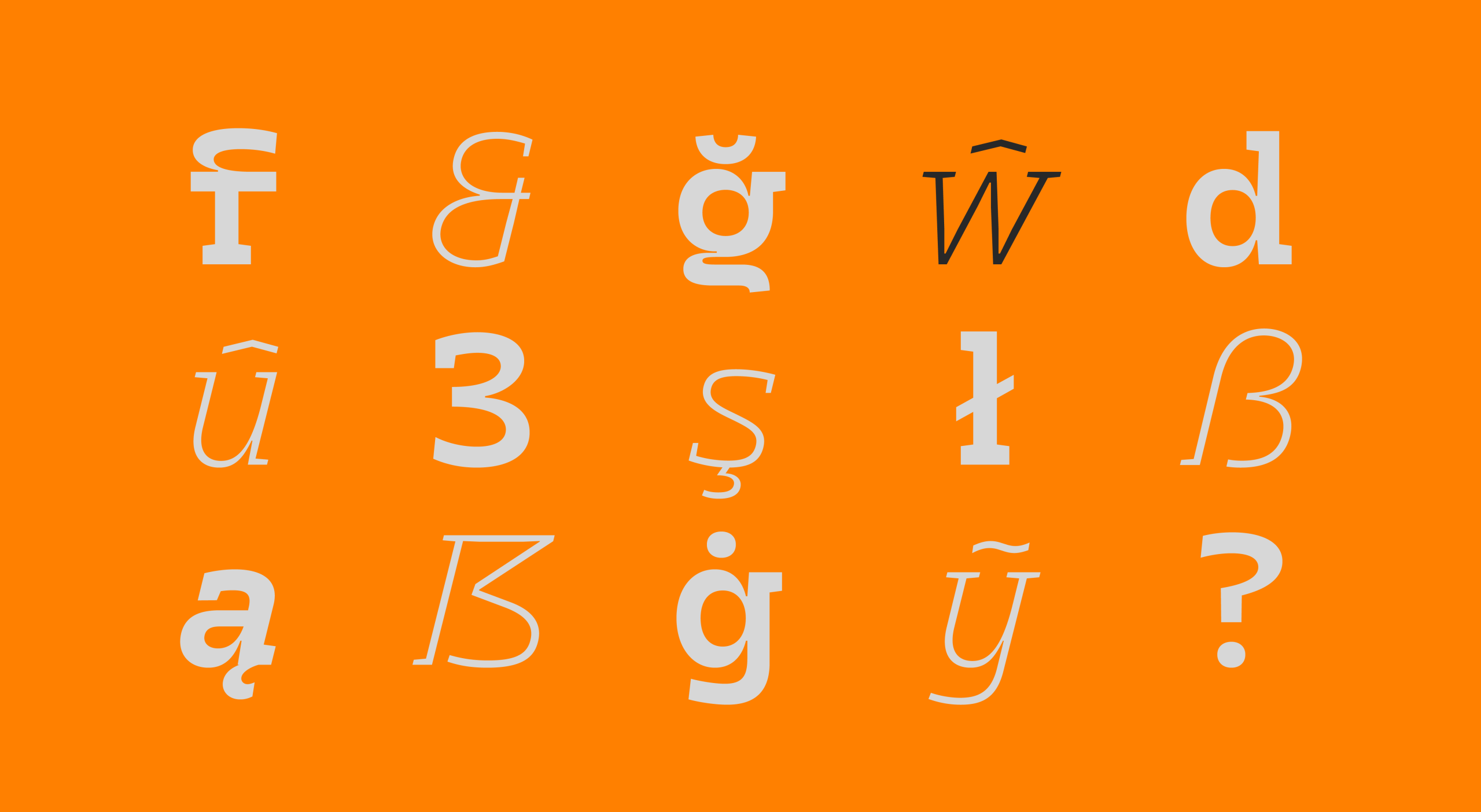
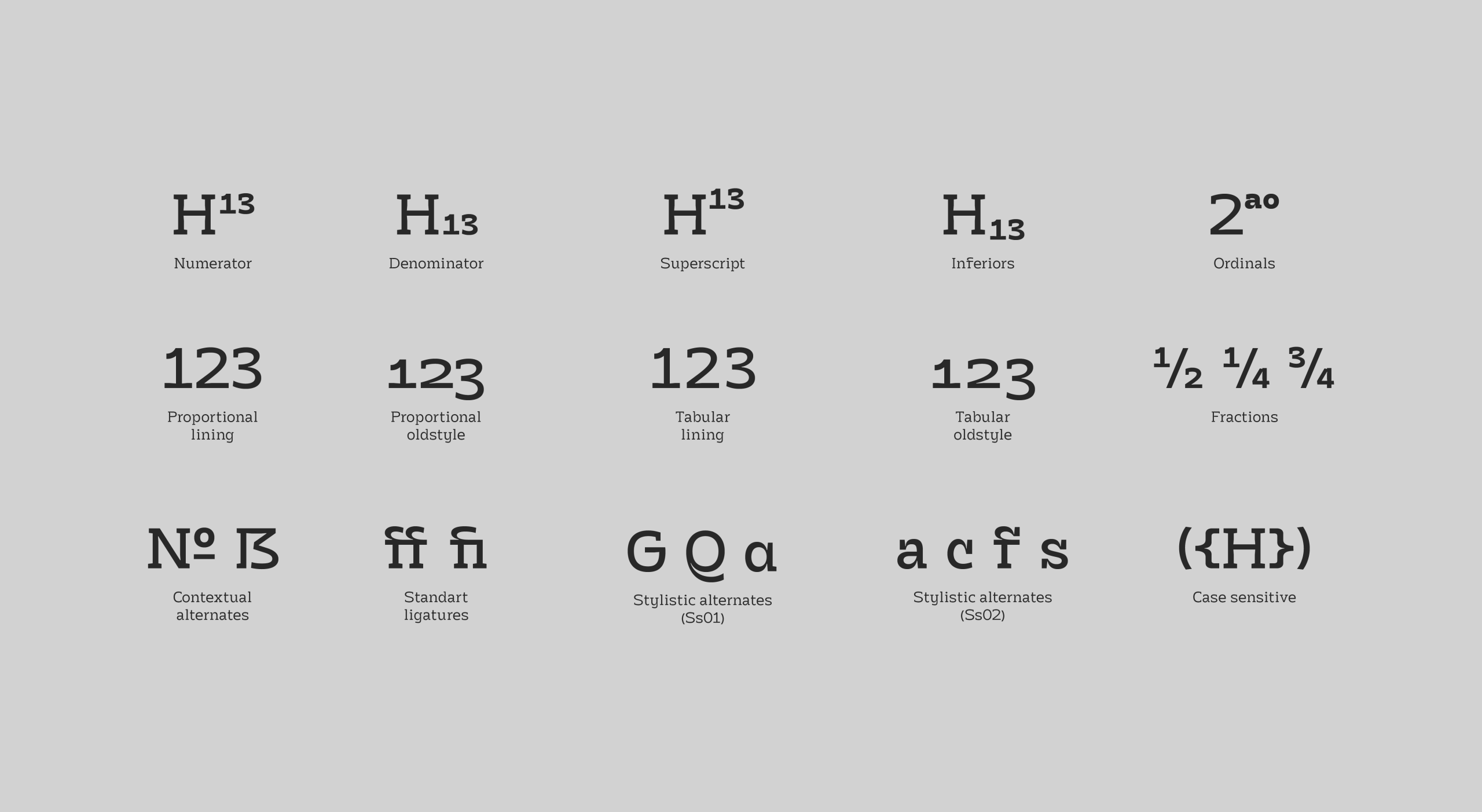
Essa provocação visual serve para demonstrar possibilidades, não limitar aplicações. A Nahor Slab foi construída para funcionar em qualquer contexto onde se busca personalidade tipográfica distintiva. Com 16 pesos, versões itálicas completas, 670 glifos, 94 idiomas e 22 recursos OpenType – completa o sistema iniciado com a Nahor Sans, oferecendo a possibilidade de trabalhar com duas vozes tipográficas que compartilham o mesmo DNA conceitual mas oferecem personalidades distintas.
EN
Why not?
Making the Nahor Slab was more challenging than it seemed, and passionate work. Even having the entire structure of Nahor Sans as foundation, as I worked on the slab, I kept discovering attributes and pitfalls that required deeper exploration.
But here I want to share another perspective beyond the technical aspects of the font, a backstage view: while working on a font, I'm already thinking about its application possibilities. It's a slab serif, it has its established place in human consciousness: "robust," "static," "traditional," normal.
And since the Nahor Sans specimen was applied to F1 illustrations, why not do the same with the slab? So, beyond the pleasure of developing another type family, I had the pleasure of breaking expectations in its launch campaign - applying a slab serif where theoretically it "shouldn't" be. Why not slabs in Formula 1? The sport with the most sponsors and visible text in a single weekend?
This shouldn't work, but it does.
This visual provocation serves to demonstrate possibilities, not limit applications. Nahor Slab was built to work in any context where distinctive typographic personality is sought. With 16 weights, complete italic versions, 670 glyphs, 94 languages, and 22 OpenType features - it completes the system started with Nahor Sans, offering the possibility to work with two typographic voices that share the same conceptual DNA but offer distinct personalities.
Ano: 2025
Versão: 1.00
Support for 94 languages
Afrikaans, Albanian, Asu, Basque, Bemba, Bena, Breton, Catalan, Chiga, Colognian, Cornish, Croatian, Czech, Danish, Dutch, Embu, English, Esperanto, Estonian, Faroese, Filipino, Finnish, French, Friulian, Galician, German, Gusii, Hungarian, Icelandic, Indonesian, Irish, Italian, Kabuverdianu, Kalenjin, Kamba, Kikuyu, Kinyarwanda, Latvian, Lithuanian, Lower Sorbian, Luo, Luxembourgish, Luyia, Machame, Makhuwa-Meetto, Makonde, Malagasy, Maltese, Manx, Meru, Morisyen, North Ndebele, Norwegian Bokmål, Norwegian Nynorsk, Nyankole, Oromo, Polish, Portuguese, Quechua, Romanian, Romansh, Rombo, Rundi, Rwa, Samburu, Sango, Sangu, Scottish Gaelic, Sena, Serbian, Shambala, Shona, Slovak, Soga, Somali, Spanish, Swahili, Swedish, Swiss German, Taita, Teso, Turkish, Upper Sorbian, Uzbek (Latin), Volapük, Vunjo, Walser, Welsh, Western Frisian, Zulu